I've got to agree about the font. It's so tacky that it makes me mad (it's Bernhard Modern for all you font geeks out there --a nice font when used correctly, but NOT ON A SYNTH!). What's really annoying is not just that he changed the logo at all (which is kind of like poorly forging someone's signature in my book), but that he _half_ changed he logo. He kept the original stylized "R" but changed the font of "Roland". UGH. I won't even comment on the white.
The replacement of the original brand/model fonts is aweful. Primarily because the poor choice of fonts... these look like Garammond or some similar typeface. The original type is truly badass... why substitute it with these rather weak replacements?
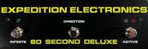
The white treatment on the other hand is cool though. Same goes for the integrated PG-200 controller.
Does anyone know what the "advanced midi" on this synth refers to?


Yay!
ReplyDeleteNeed a 110V power converter before I can post any vids, though... :o)
I'm not a big fan of the font used...
ReplyDeleteit kind of removes the "electro" feeling out of the jx3p.
but it is just my point of view.
The built-in programmer is the coolest thing ever. No more worrying about loosing that funky cable.
ReplyDeleteI've got to agree about the font. It's so tacky that it makes me mad (it's Bernhard Modern for all you font geeks out there --a nice font when used correctly, but NOT ON A SYNTH!). What's really annoying is not just that he changed the logo at all (which is kind of like poorly forging someone's signature in my book), but that he _half_ changed he logo. He kept the original stylized "R" but changed the font of "Roland". UGH. I won't even comment on the white.
ReplyDeleteYes, I'm a design geek as well as a synth geek.
no. that's definetely pretty. congrats :)
ReplyDeleteThe replacement of the original brand/model fonts is aweful. Primarily because the poor choice of fonts... these look like Garammond or some similar typeface. The original type is truly badass... why substitute it with these rather weak replacements?
ReplyDeleteThe white treatment on the other hand is cool though. Same goes for the integrated PG-200 controller.
Does anyone know what the "advanced midi" on this synth refers to?
Please Dave, no more corny prog rock videos.
ReplyDeleteDare to be different, in both font choices and prog rokkin. It is every much my right to clutter up your internets as it is for you to protest.
ReplyDeleteYay me!
+ 100 coolness points for built-in programmer.
ReplyDelete-101 coolness points for unfortunate typographic choices. Double penalty points for invoking the Brush Script typeface for any reason whatsoever.
to all the anal inc jonathan hughes , flankers , if not happy with it then you do it better ,
ReplyDelete